


We knew when releasing our latest Fruit Punch seasonal blend that it's a little different to your everyday coffee blend. It catches you off guard, takes your taste buds for a ride and, most importantly, pushes boundaries in terms of what coffee can be.
Same with our packaging, and in keeping with the tradition, we've enlisted another Kiwi artist for this year's iteration. His face will most likely be unfamiliar (the only available photo online dates back 10 years...), yet you're bound to have seen James Stewart's work at your local supermarket. The artist behind the Gingerella artwork talked us through his creative process while sipping on our Fruit Punch blend.

How did you come about creating the artwork for this year's Fruit Punch? What brief were you given?
I was told ‘Hey, do something cool for Fruit Punch’…The brief was pretty loose – interestingly no pressure, because it’s not the core part of the brand. This is an opportunity to have a small peripheral piece of brand work which is fun, silly, and eye-catching. It’s the perfect brief, because there’s no pressure to be functional or jump through hoops that are required by “branding”.
How did you turn 'something cool' into purple nesting cups?
Casey sort of talked me through the Fruit Punch concept. What I thought was cool was that there’s no actual fruit in it. There’s some weird logic behind how I got to the end result, because what caffeine, coffee and flavour does is all psychological, it’s in your head – you can taste fruit without any fruit being involved. This idea that coffee is doing interesting tricks to your brain somehow wound up with me having empty-headed people with brains full of coffee.
Do you usually go for those 'out-there' ideas?
I’ll be honest, I started a lot more literal: it’s called Fruit Punch, so let’s have fruit punching other fruits, or a fist punching fruits, fruit being punched out of a coffee cup, etc. I gave Casey a bunch of ideas that range from what I thought is really pragmatic – something that an advertising agency would automatically give the green light to, versus something that is a silly, ridiculous idea that you should probably say no to, and Casey said ‘that’s the one’.
 Although you work on a variety of medium and with brands which must ask for specific styles, I found some common threads in your work – cartoonish elements, ample use of bright and complementary colours, round lines, and a playfulness, something almost ‘childish’… Would you agree?
 I don’t shy away from ‘childish’. If someone ever says to a creative person “my kid could have done that”, that is the most flattering thing you can possibly say. It means that you have somehow captured something so primal, essential and effortlessly fun about the idea that a child, with all its innocence, could have come up with it. Of course, that’s not true, because it actually takes a lot of time and effort to do something that simple. Simple is hard.
How was this brief and exercise different from other bits of commercial advertising work you've submitted before?
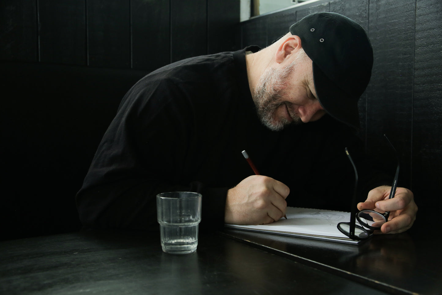
This Fruit Punch style is something I have done quite a bit of, but it was an opportunity to experiment, get the pens out and do things that are a bit more tactile than the digital work I usually produce. It’s all painted with black ink, and the colours have been later applied digitally. That helps with slightly rougher lines: unlike digital artwork, you can see that it is done by a person - you can see my ‘hand’, my style.
As a contractor and freelance creative worker, you have to juggle with a range of works at any given time. How easy is it to switch from one project to the next?
It is a huge challenge, but I don’t think it is limited to artists. Every time you jump between two jobs you need to rest your brain, to some degree.
My creative process is pretty unstructured, by design. I just have my way of doodling until I dig something, and hopefully someone else digs it to. I work unusual hours, as I’m most creative at night. There’s something about night-time where the creativity starts flowing. Anyone who’s spent a lot of time refining a skill will have that experience with flow-state, where you’re kind looking at what you’re doing and you can’t explain it or take credit for it but it’s just happening, it’s just pouring out.
Is commercial work the bulk of your artistic creation? Or do you have any work of arts that are more personal?
Essentially it is. I would like to do more self-initiated stuff, but after drawing for ten hours, am I going to kick my feet up and draw some more? Probably not… That being said, that’s what was great about this artwork for Fruit Punch. Yes, it’s a piece of commercial work, but it’s not approached like a piece of commercial work at all. The brief is heaps looser, so I’ve got a lot of freedom to have fun and work on the skills that I want to get better at. If it was purely self-initiated, I wouldn’t be in a position to be out there to be seen by people.
Would you rather your work lived in people's hands, instead of being hung on gallery walls or stored in your laptop?
That’s the main objective: to have artwork that is out into the world for people to see, enjoy and probably never know who did it. I’m totally fine with that. I could do a tour of a supermarket where my work is on the packaging of some big brand products, and my name is not on it – I don’t mind, I just dig that it’s out in the world. This Fruit Punch packaging work is like a piece of self-initiated work, but it’s also out in the world for your customers to enjoy.
Check out more of James' artwork here.